Best Squarespace website examples for 2025
Squarespace makes it easy to build beautiful, high‑performing websites, and the best Squarespace website examples show how far the platform can go in real projects. Below is a curated set of categories with standout picks and a direct link after each bullet so you can explore immediately.
Portfolio and creative studios
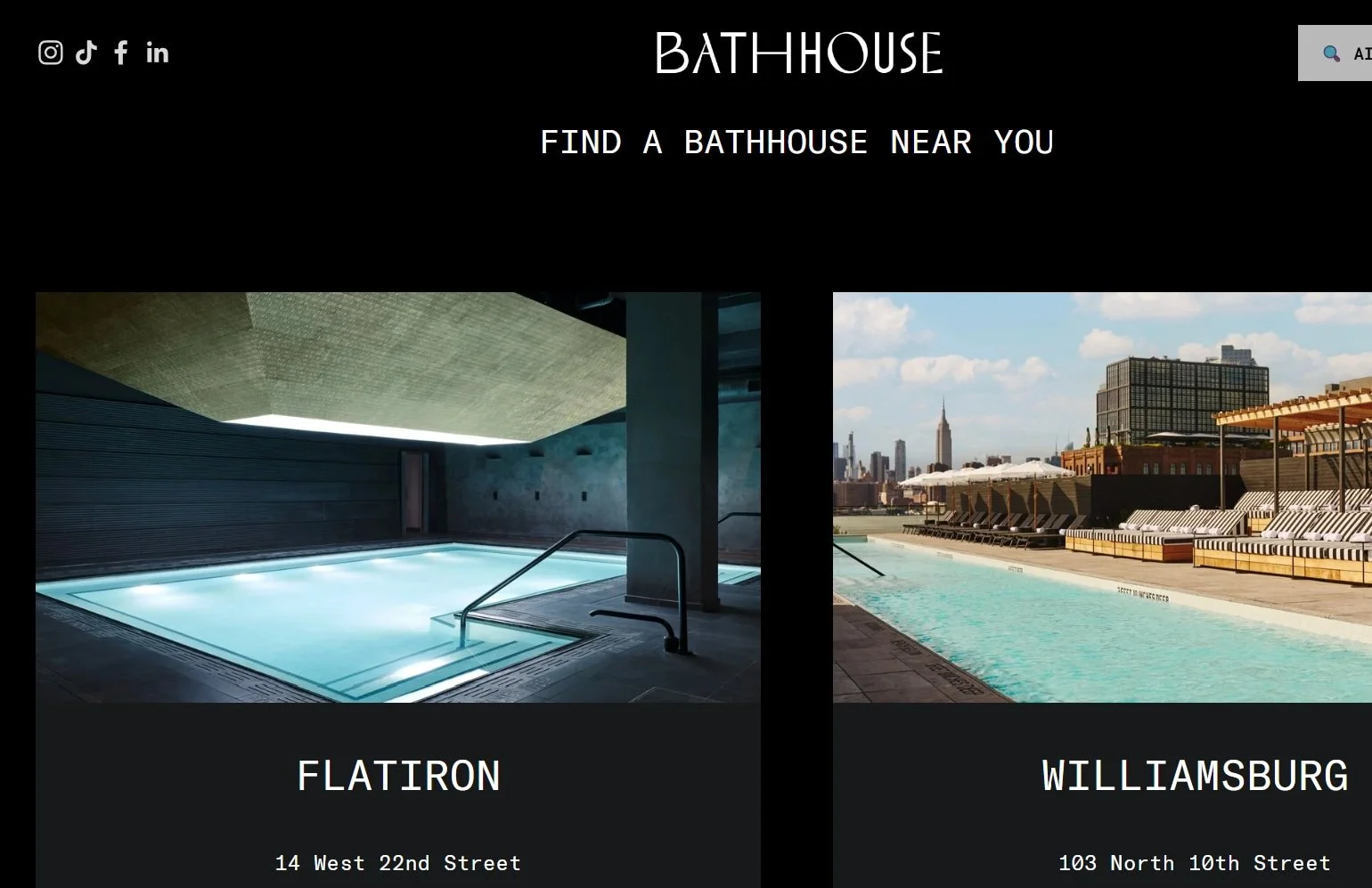
Bathhouse — premium spa aesthetic with editorial layout: Bold typography, immersive photography, and clean booking flows create a high‑end experience that matches the brand’s physical space. https://www.sitebuilderreport.com/squarespace-examples
Curated designer portfolios — modular grids, consistent image ratios: Strong examples keep navigation simple, use restrained color systems, and highlight case studies with process visuals. https://www.sitebuilderreport.com/squarespace-examples
Restaurants and hospitality
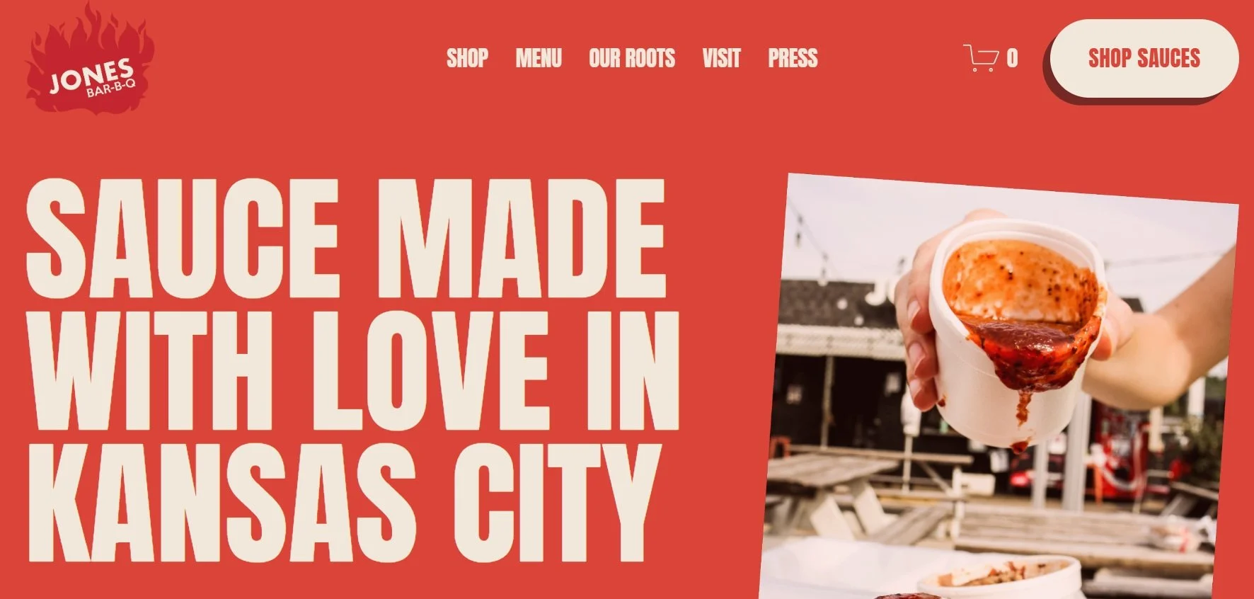
Jones Bar‑B‑Q — story‑driven content that converts to orders: Clear menu paths, authentic brand storytelling, and easy access to sauces and locations demonstrate how hospitality sites can turn cravings into visits and purchases. https://www.sitebuilderreport.com/squarespace-examples https://ecomm.design/site/jones-bar-b-q/
Hotels, retreats, venues — amenity blocks with persuasive booking UI: Successful examples lean on testimonials, itineraries, and concise FAQs to reduce booking friction while showcasing experience highlights. https://www.applet.studio/blog/squarespace-for-restaurants
Deep dive: Jones Bar‑B‑Q (why this Squarespace site works)
Jones Bar‑B‑Q’s site pairs large, appetite‑driven visuals with bold type, keeping the path to action obvious: find the location, view the menu, and buy the signature sauces. The brand story—originating in Kansas City and family‑run roots—appears early, building trust and differentiating them from generic barbecue spots. The layout prioritizes scannability: a hero section with a clear CTA, followed by product highlights and social proof. Navigation stays minimal to reduce decision fatigue, which is crucial for mobile visitors. Technical choices matter too: Squarespace’s built‑in commerce and responsive templates keep performance and consistency tight, so the same conversion flow works on phones and desktops. Their use of reassurance elements—shipping info, support details, press mentions—nudges hesitant buyers toward checkout without feeling pushyEcomm.Design+1.
Ecommerce and product brands
Lifestyle storefronts — clear product cards and reassurance elements: Leading examples emphasize hierarchy, lifestyle imagery, and bold CTAs, supported by shipping/returns messaging to reduce friction. https://www.founderjar.com/squarespace-ecommerce-examples/
Merchandising patterns — cross‑sell sections and clean filters: Effective Squarespace shops use concise descriptions, consistent image ratios, and complementary product blocks to raise average order value. https://www.sitebuilderreport.com/squarespace-examples
Coaches, educators, and memberships
Coaching sites — outcome‑oriented copy with simple booking: Strong service pages tie program benefits to a clear scheduling flow, backed by testimonials and tiered pricing for clarity. https://www.sitebuilderreport.com/squarespace-examples
Education/memberships — clean enroll flows and resource sections: Course outlines, pricing tiers, and proof points (reviews, outcomes) help visitors commit quickly without complex navigation. https://www.applet.studio/blog/squarespace-for-restaurants
What these best Squarespace website examples do in common
Clarity-first structure: Clear headlines, short paragraphs, and single-purpose sections that guide visitors without overwhelming them.
Consistent design systems: Defined typography scales, spacing rhythm, and component rules (cards, buttons, forms) that keep pages cohesive.
Conversion paths on every page: Obvious next steps—book, buy, contact, or learn more—placed where attention naturally peaks.
Mobile-first polish: Tap-friendly buttons, trimmed copy, and prioritized content so the experience feels effortless on phones.
Trust and proof: Real photography, testimonials, press mentions, and reassurance elements (shipping, returns, FAQs) to reduce hesitation.
Get a site like this
If you want a Squarespace site that looks as polished as these examples—and converts—get in touch. I’ll design a clear, consistent system, build conversion-focused pages, and launch with mobile performance and trust baked in.


