
Squarespace Mobile Menu: How to Customize and Improve Your Mobile Navigation
A well‑designed Squarespace mobile menu is essential for creating a smooth browsing experience. Most visitors view websites on their phones, so your mobile navigation needs to be clear, easy to use, and visually aligned with your brand. If your desktop menu looks great but your mobile menu feels cramped or confusing, it can hurt engagement and conversions.
This guide walks you through how the Squarespace mobile menu works, how to customize it, and how to improve the overall mobile navigation experience. It follows the same steps demonstrated in the video so readers can learn everything without watching it.
Understanding the Squarespace Mobile Menu
Squarespace automatically generates a mobile menu based on your site’s navigation. When the screen size becomes small enough, the desktop navigation collapses into a mobile “hamburger” icon. Tapping this icon opens a full‑screen or slide‑out menu depending on your template.
The mobile menu pulls its structure from your Main Navigation and Secondary Navigation. Anything placed in Not Linked will not appear unless you manually add it through a folder or link.

How to Access and Edit the Mobile Menu
Squarespace does not have a separate mobile menu editor, but you can control the mobile menu through your site styles and navigation settings.
To begin editing:
Open your Squarespace site
Enter the Site Styles panel
Navigate to the Mobile or Navigation section depending on your template
Adjust the menu layout, colors, spacing, and typography
These settings allow you to change how the mobile menu looks and behaves without affecting your desktop layout.

Customizing the Look and Feel
The video demonstrates how to refine the appearance of the Squarespace mobile menu so it feels more polished and easier to navigate.
Typography
Choose a font size that is readable on small screens. Larger text improves accessibility and reduces accidental taps.
Colors
Update the background color, link color, and active link color. A strong contrast between text and background improves visibility.
Spacing
Increase the spacing between menu items to prevent the menu from feeling cramped. This also improves tap accuracy.
Menu Icon
Some templates allow you to adjust the size and style of the hamburger icon. A slightly larger icon is easier for users to tap with their thumbs.

Organizing Your Navigation for Mobile
A clean mobile menu starts with a well‑organized navigation structure.
The video emphasizes:
Keep the top‑level items simple
Avoid long labels or too many items. Mobile users prefer quick access to the most important pages.
Use folders for grouping
Folders help you organize related pages under a single expandable section. This keeps the mobile menu tidy and easier to scan.
Hide unnecessary pages
If a page does not need to appear in the mobile menu, move it to Not Linked. You can still link to it from buttons or sections on your site.
Improving the User Experience
A strong Squarespace mobile menu is not just about appearance. It also needs to function smoothly.
Here are the improvements shown in the video:
Ensure the menu closes when a link is tapped
Squarespace handles this automatically, but if you use custom code or third‑party scripts, test the behavior to make sure the menu closes properly.
Test on multiple devices
Preview your site on different phones and screen sizes. What looks good on one device may feel cramped on another.
Keep the menu consistent
Avoid changing the order of items between desktop and mobile. Consistency helps users navigate more confidently.
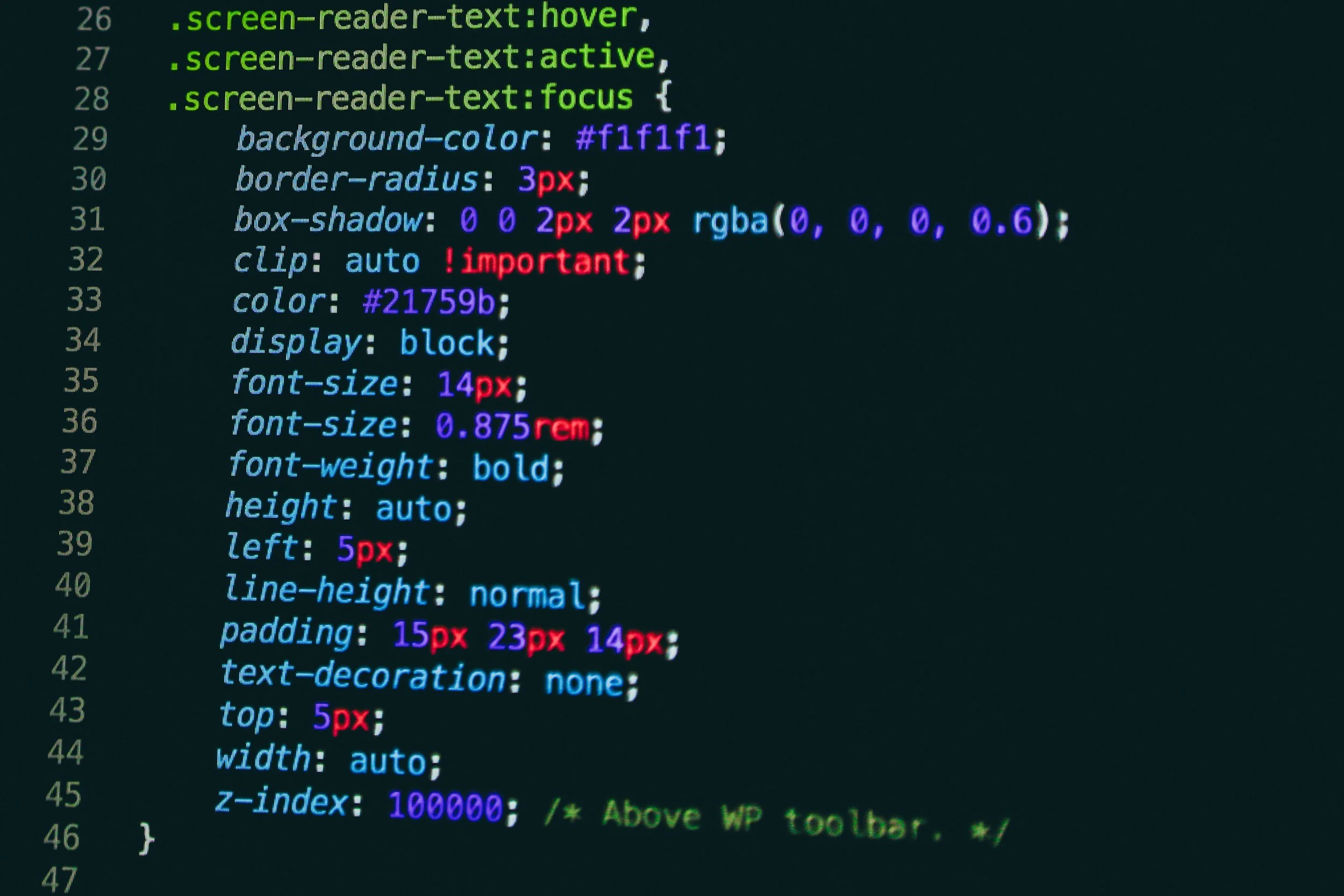
Adding Custom Code (Optional)
Some designers prefer to enhance the Squarespace mobile menu with small code snippets. The video demonstrates how to apply simple CSS to adjust spacing, alignment, or menu width.
If you choose to add custom CSS:
Go to Design → Custom CSS
Paste your code into the editor
Refresh your mobile preview to see the changes
Always test your code on multiple devices to ensure it behaves correctly.
Final Checks Before Publishing
Before you finalize your mobile menu, run through this quick checklist:
Confirm all menu items are easy to tap
Check that the text is readable without zooming
Make sure the menu opens and closes smoothly
Test the menu on both iPhone and Android devices
Review the menu in both portrait and landscape orientation
A polished mobile menu improves user experience and helps visitors navigate your site with confidence.
Final Thoughts
A well‑designed Squarespace mobile menu can make a significant difference in how users experience your website. By adjusting the layout, organizing your navigation, and refining the visual style, you create a mobile experience that feels professional and intuitive.
If you want help improving your mobile navigation or customizing your Squarespace site, I can walk you through the process or handle the design work for you. Just reach out and we can get started.